Portfolio
For the best experience, view these on a wide screen. For example, a tablet or laptop.
Animations tests


Above I have three animation tests for water, just figuring out timing and style.

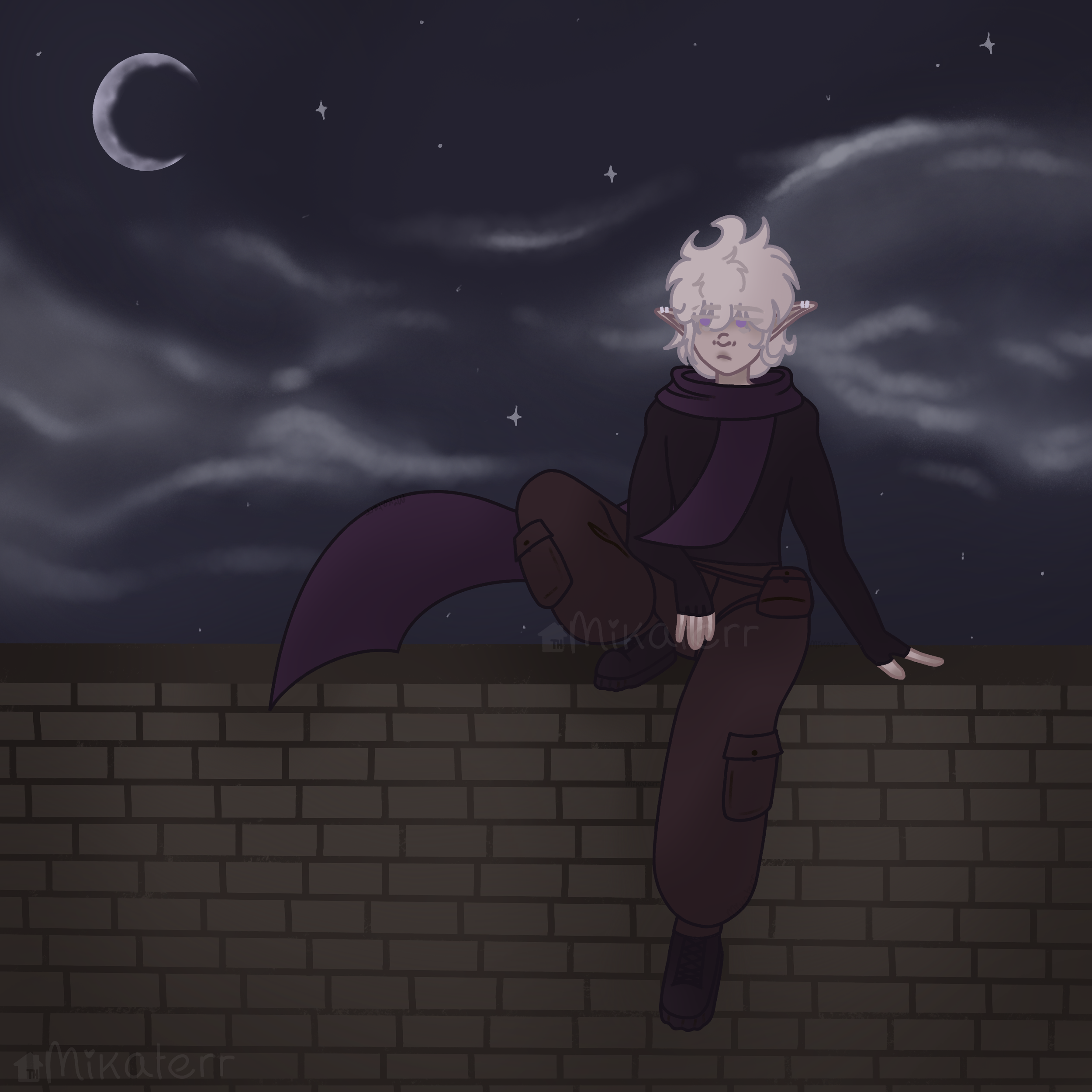
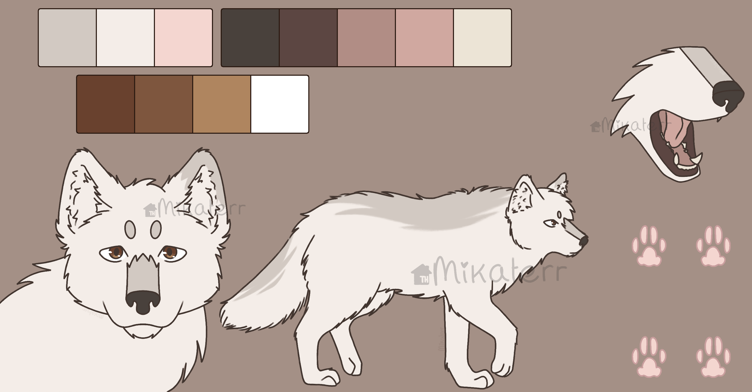
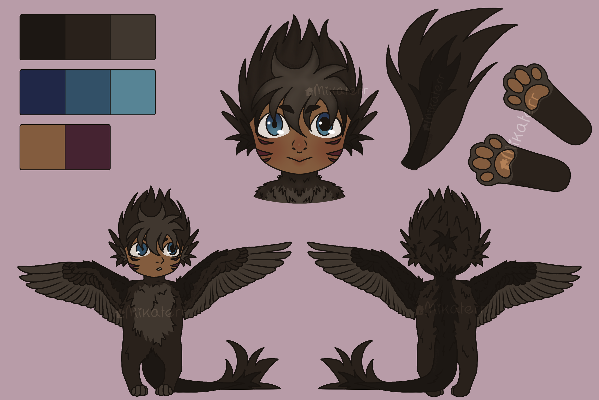
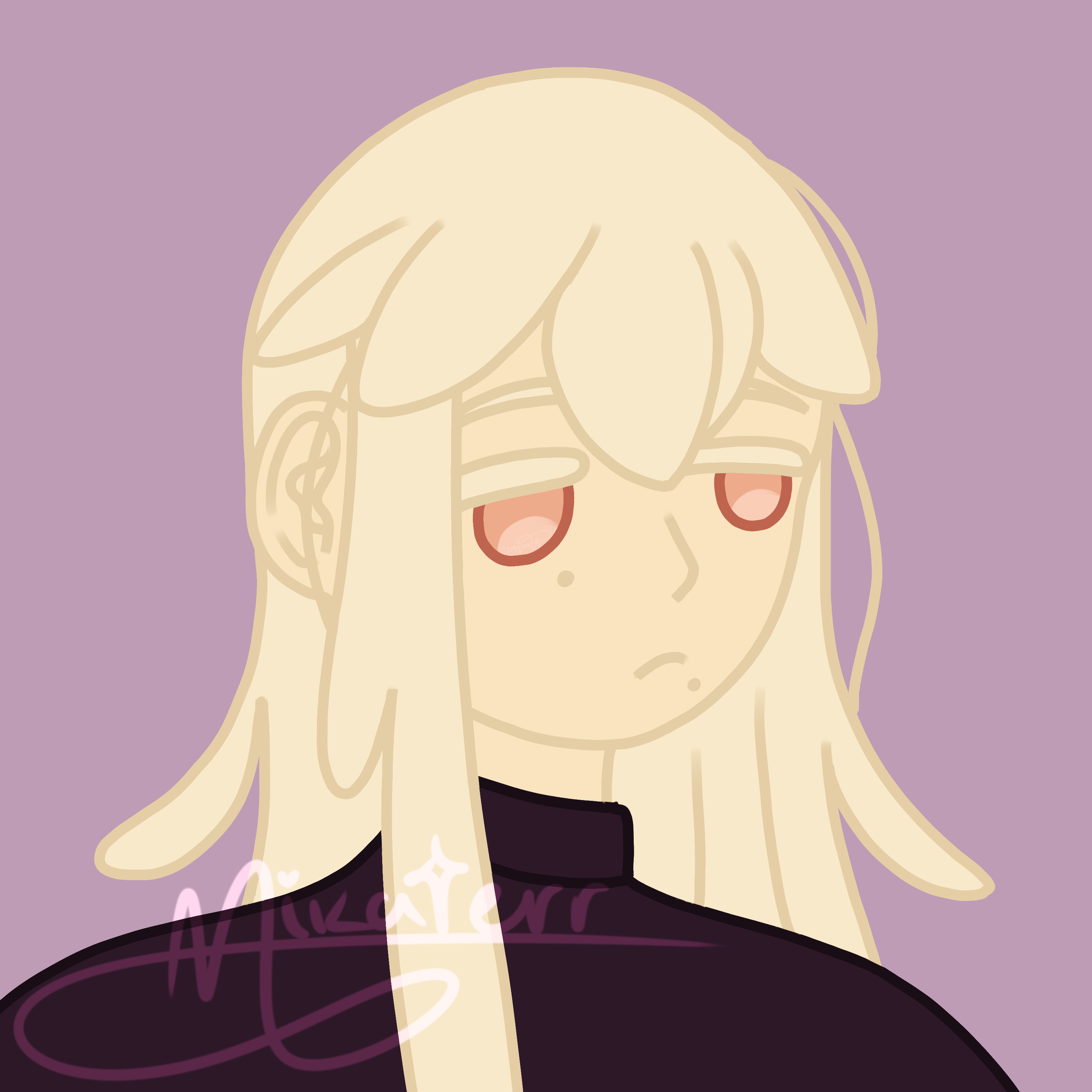
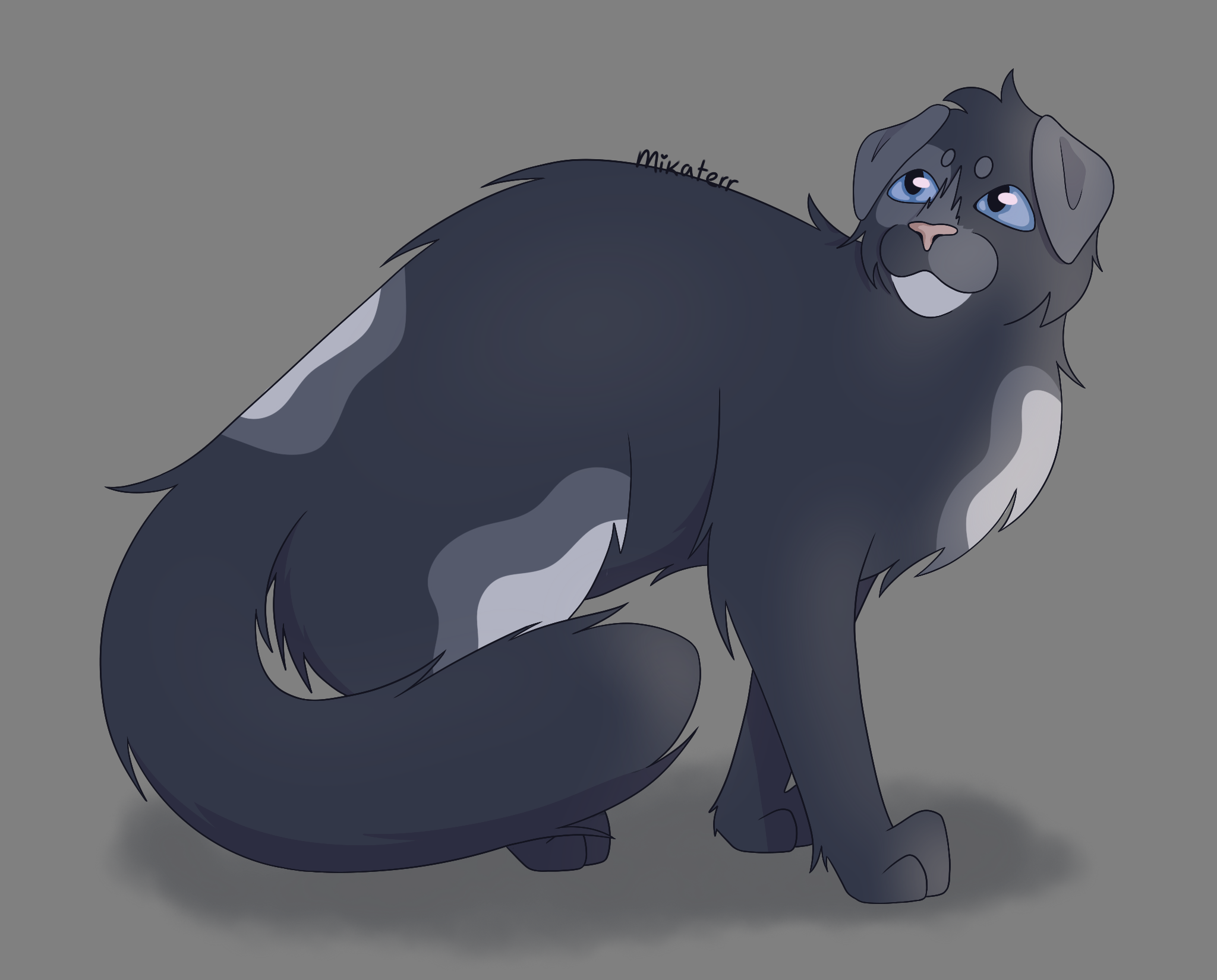
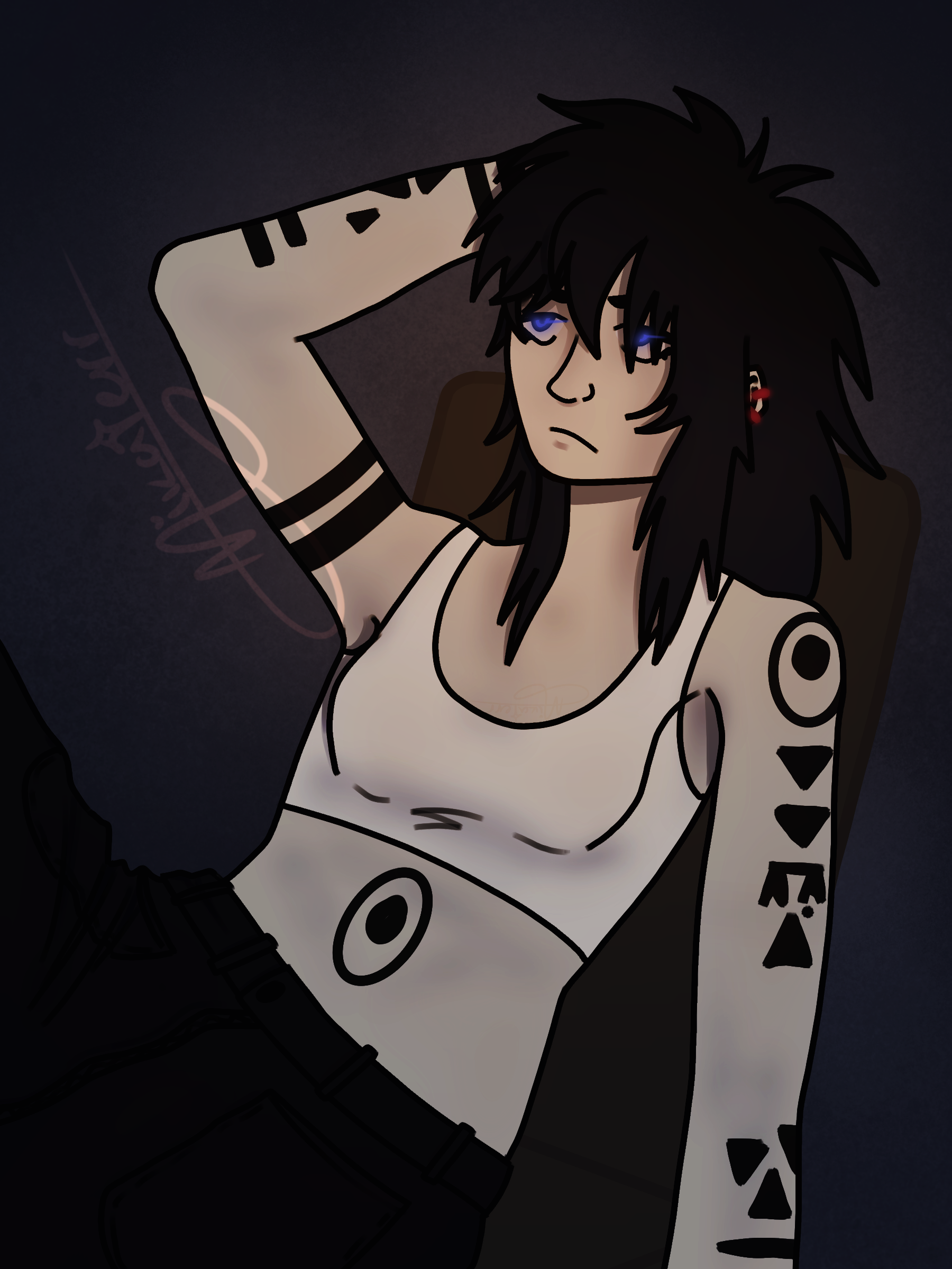
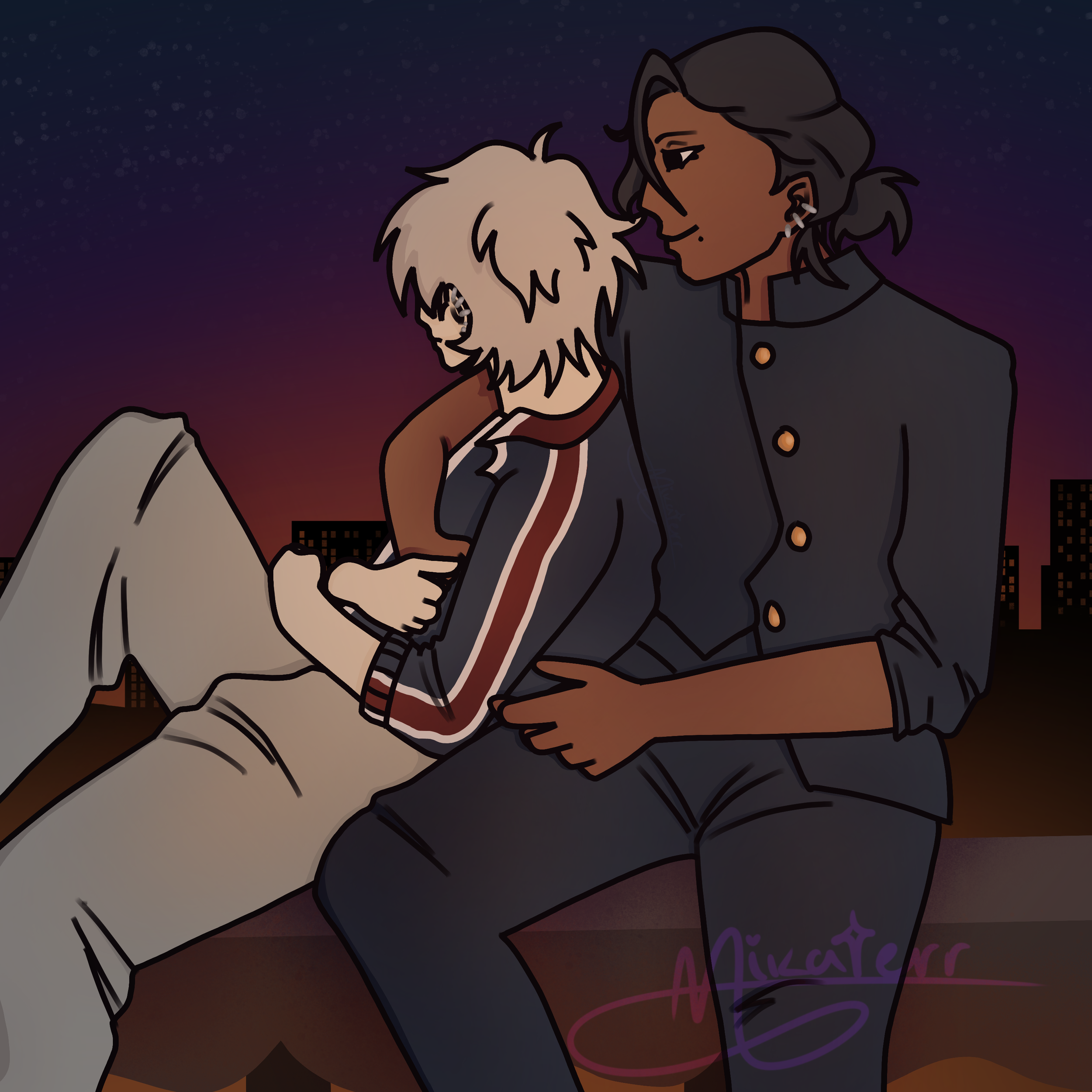
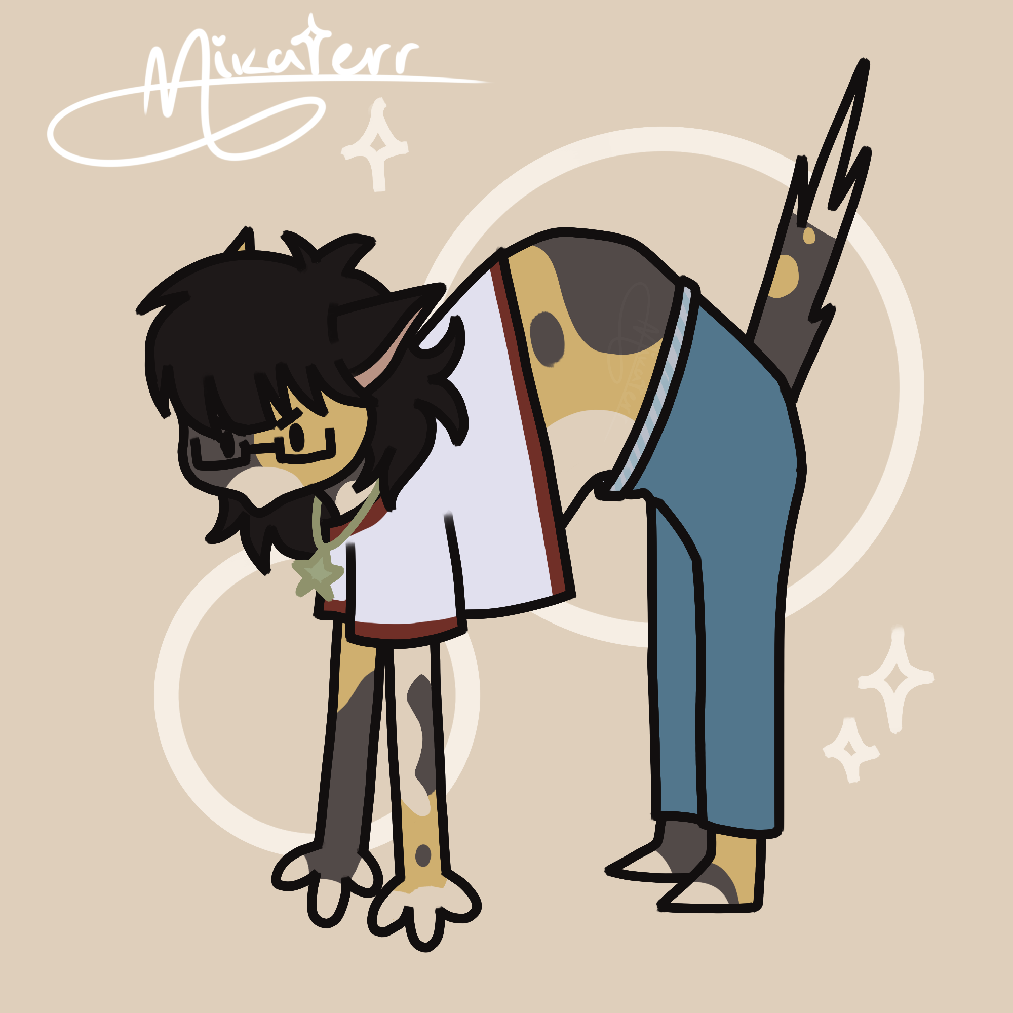
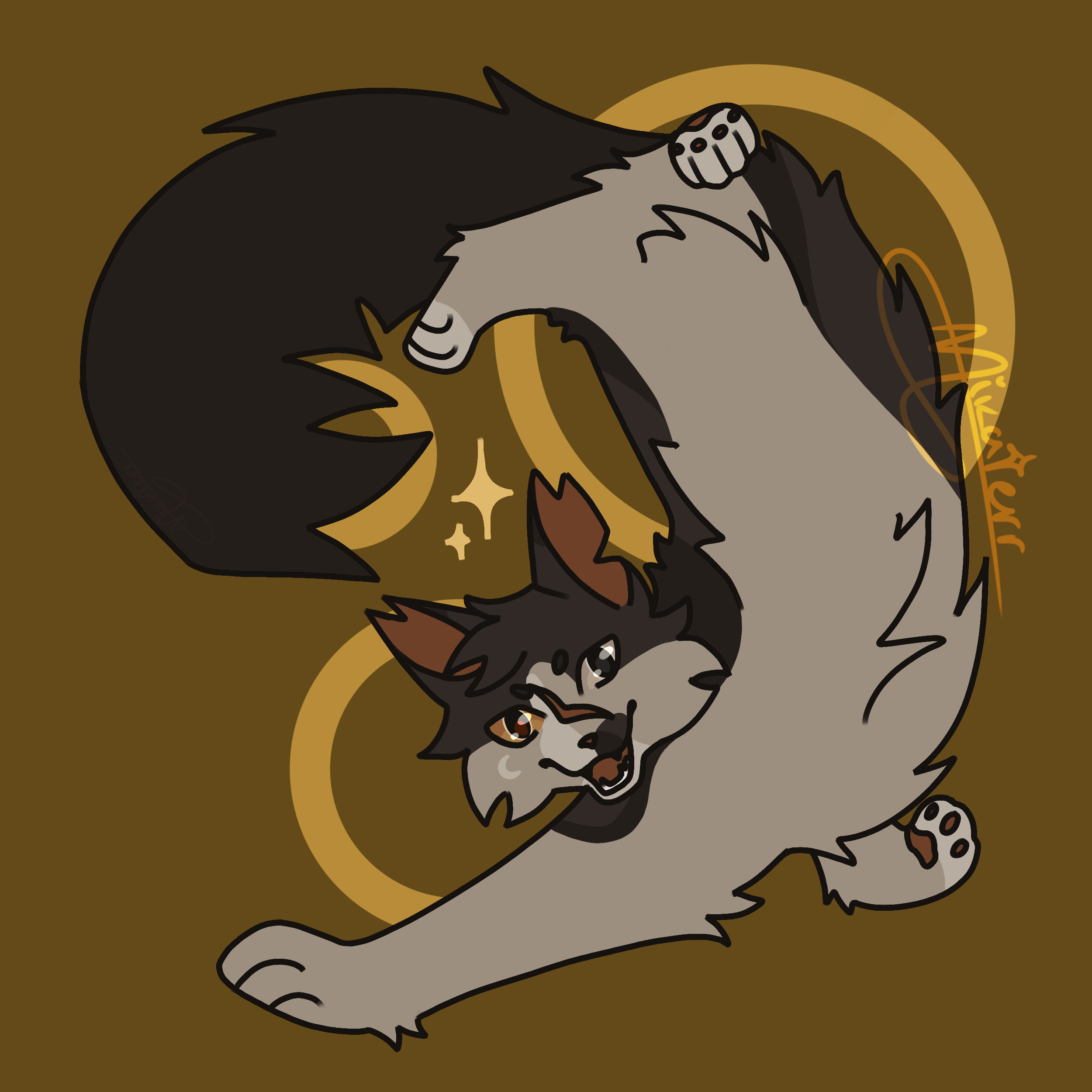
OC Art
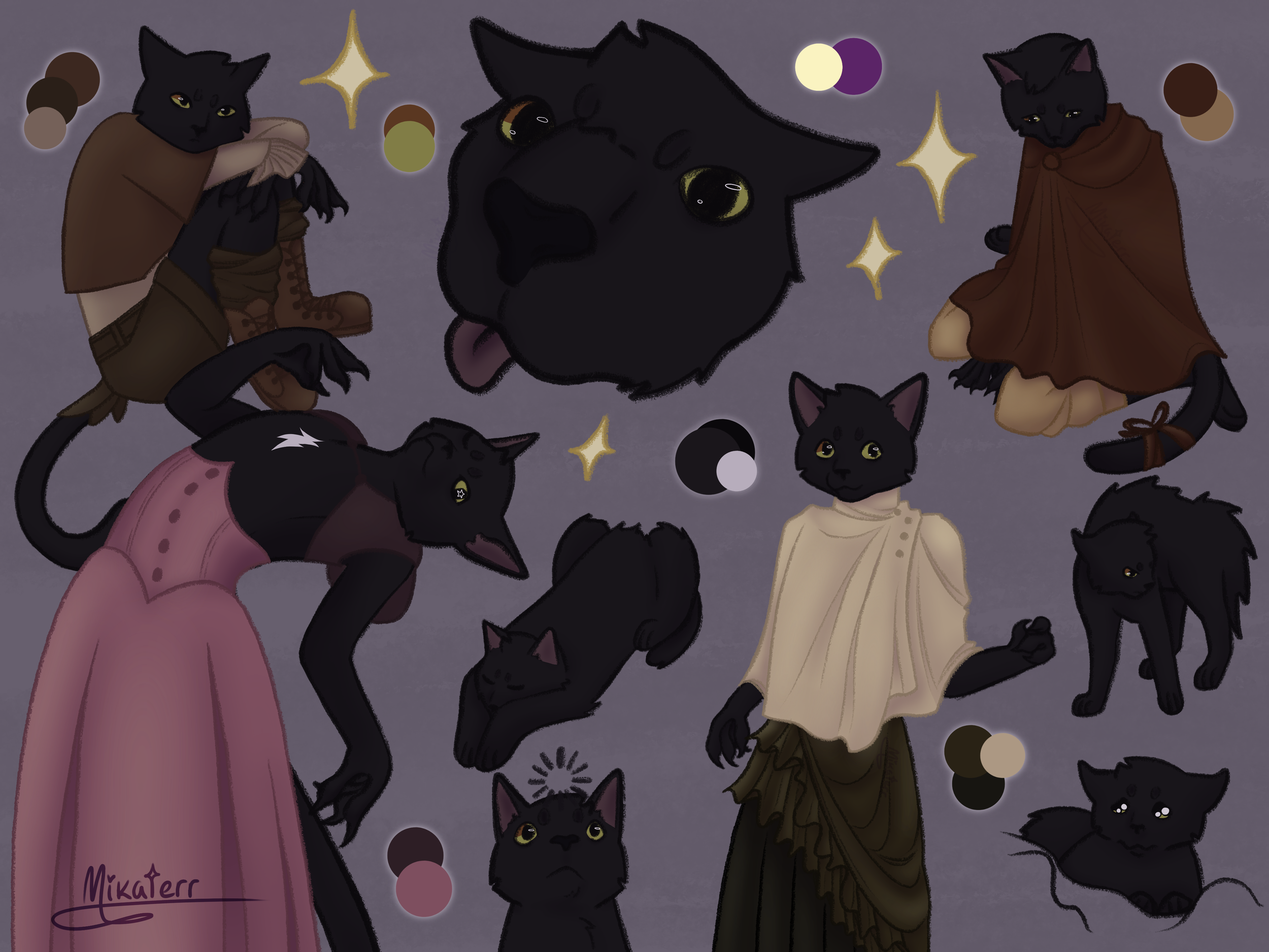
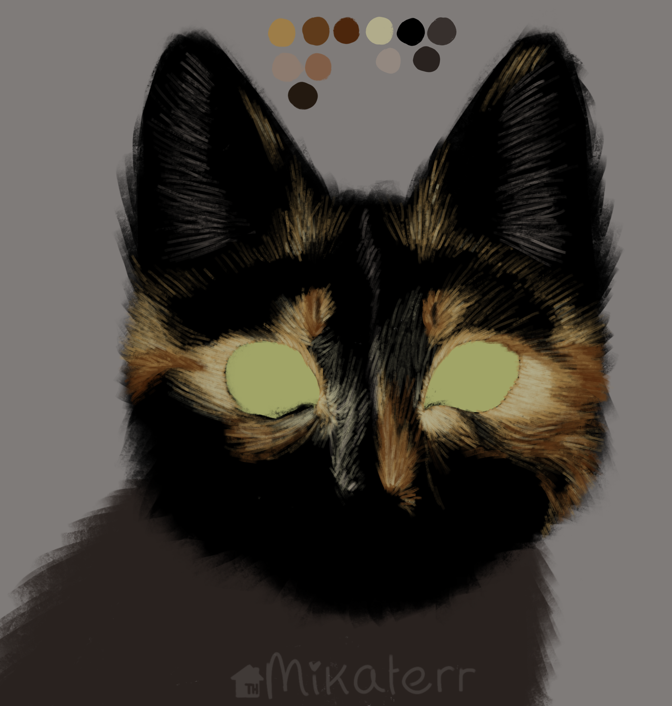
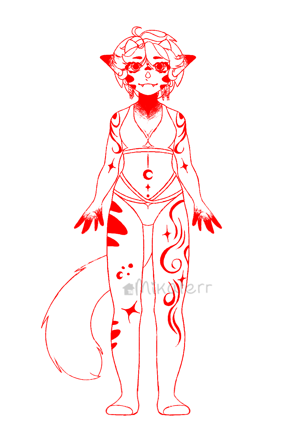
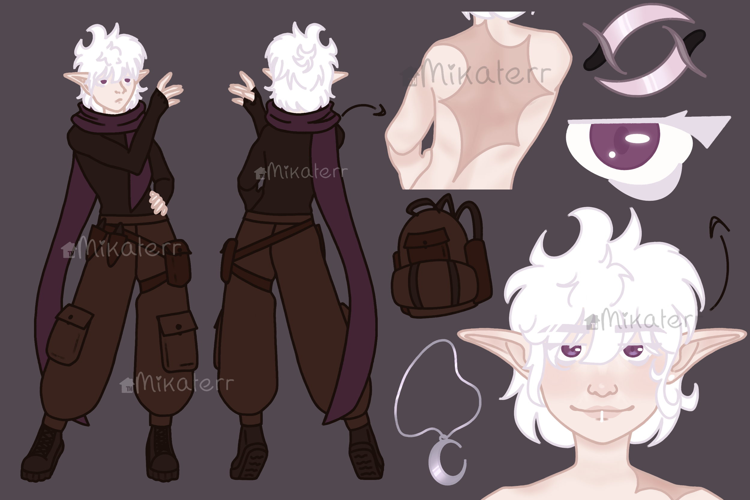
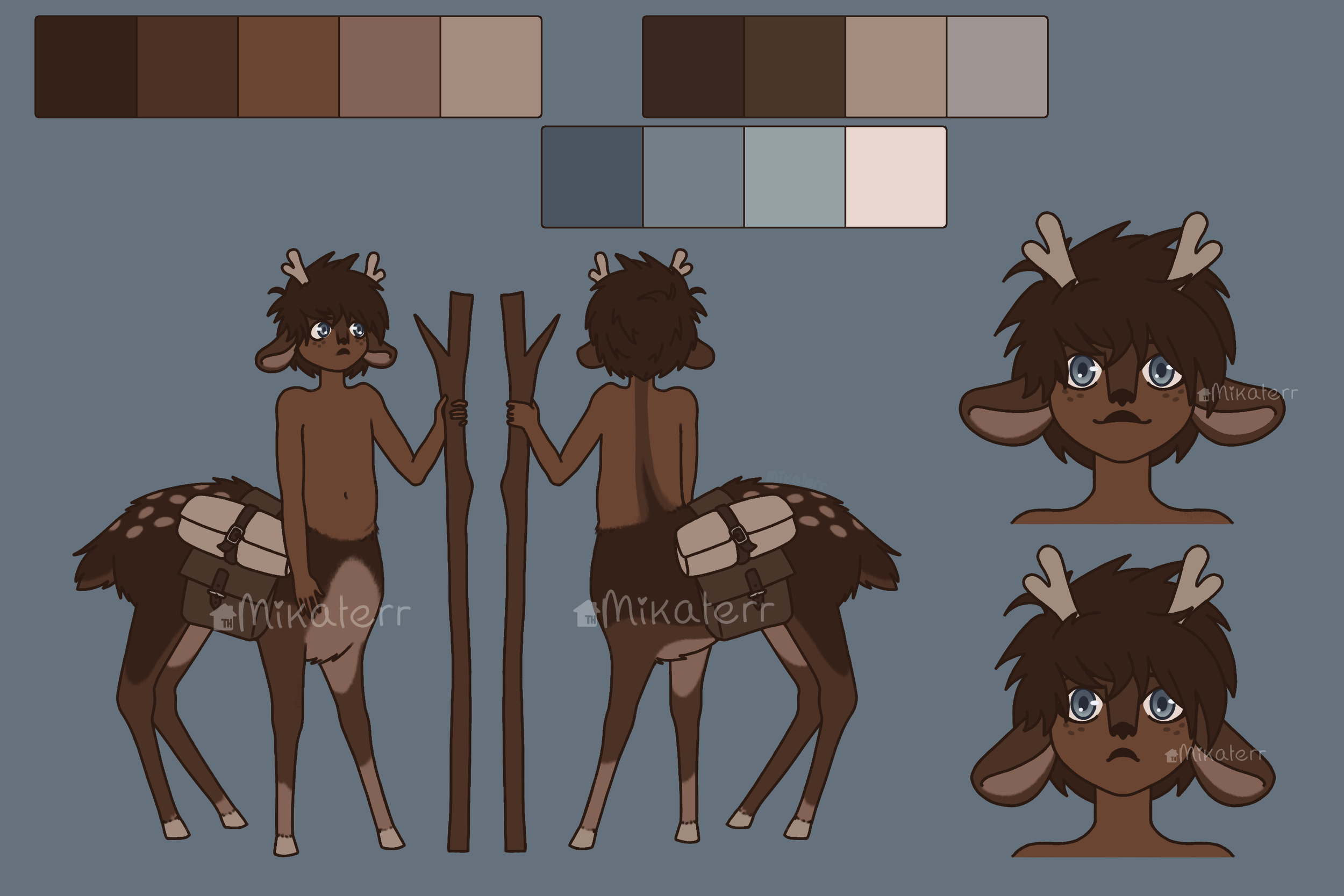
Character sheets


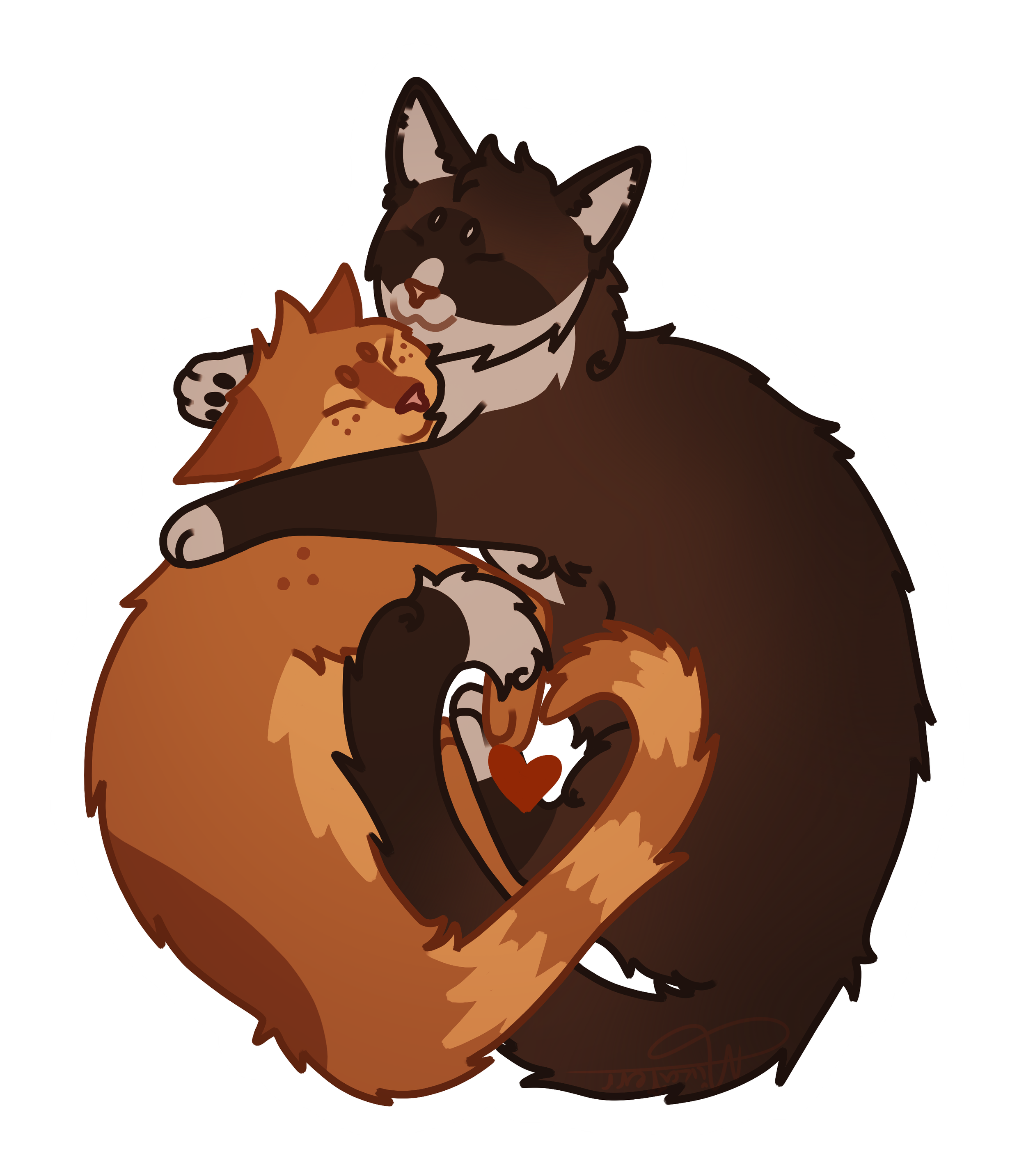
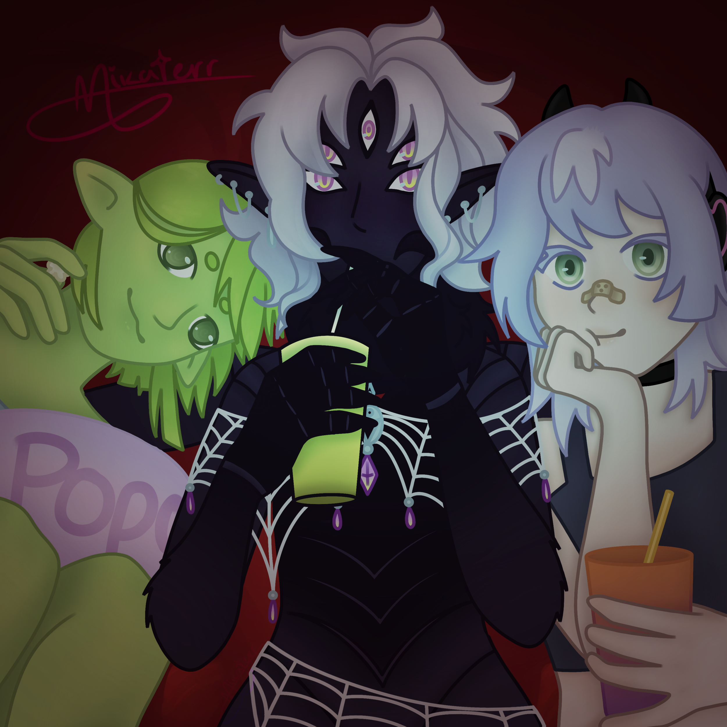
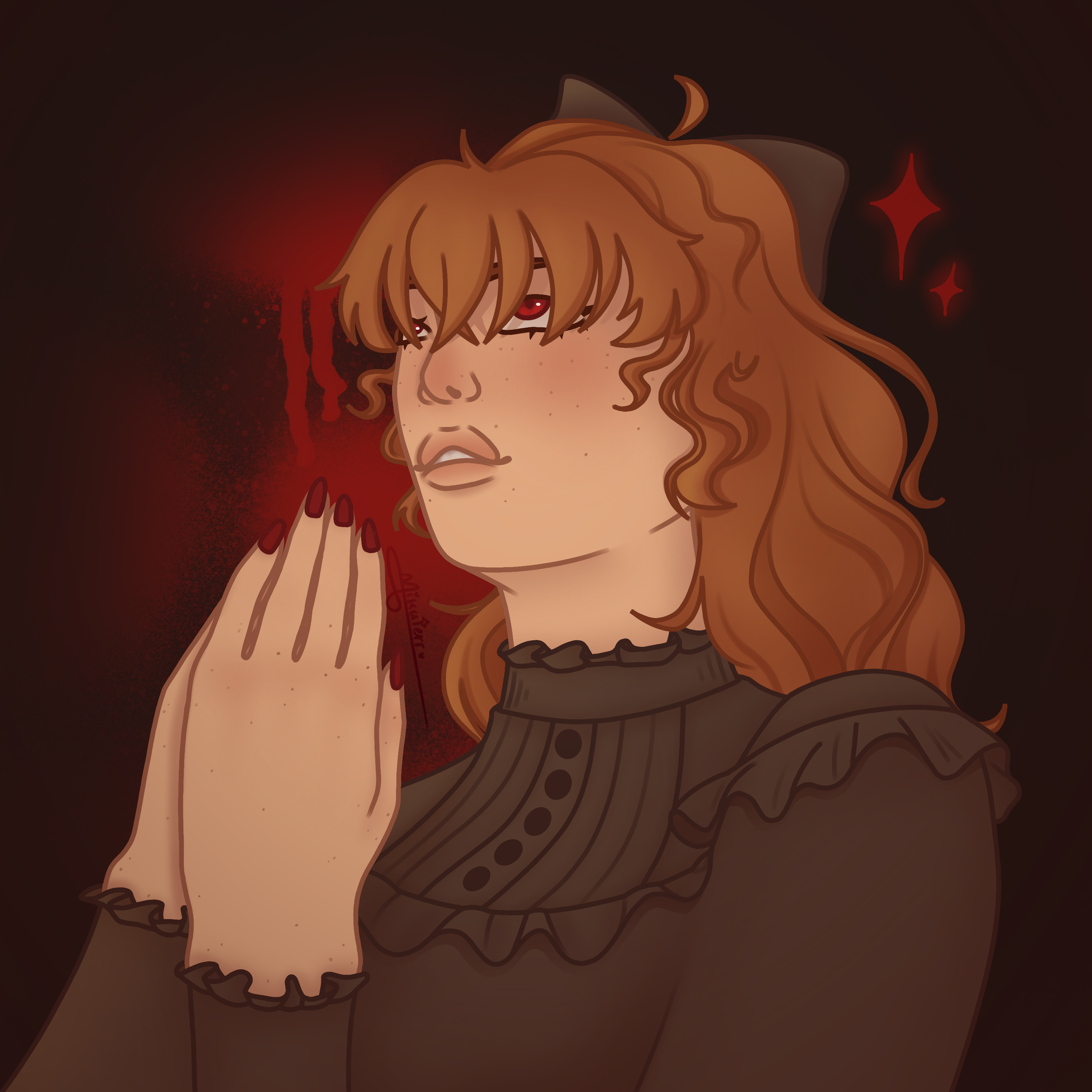
Gift Art / Art Trades

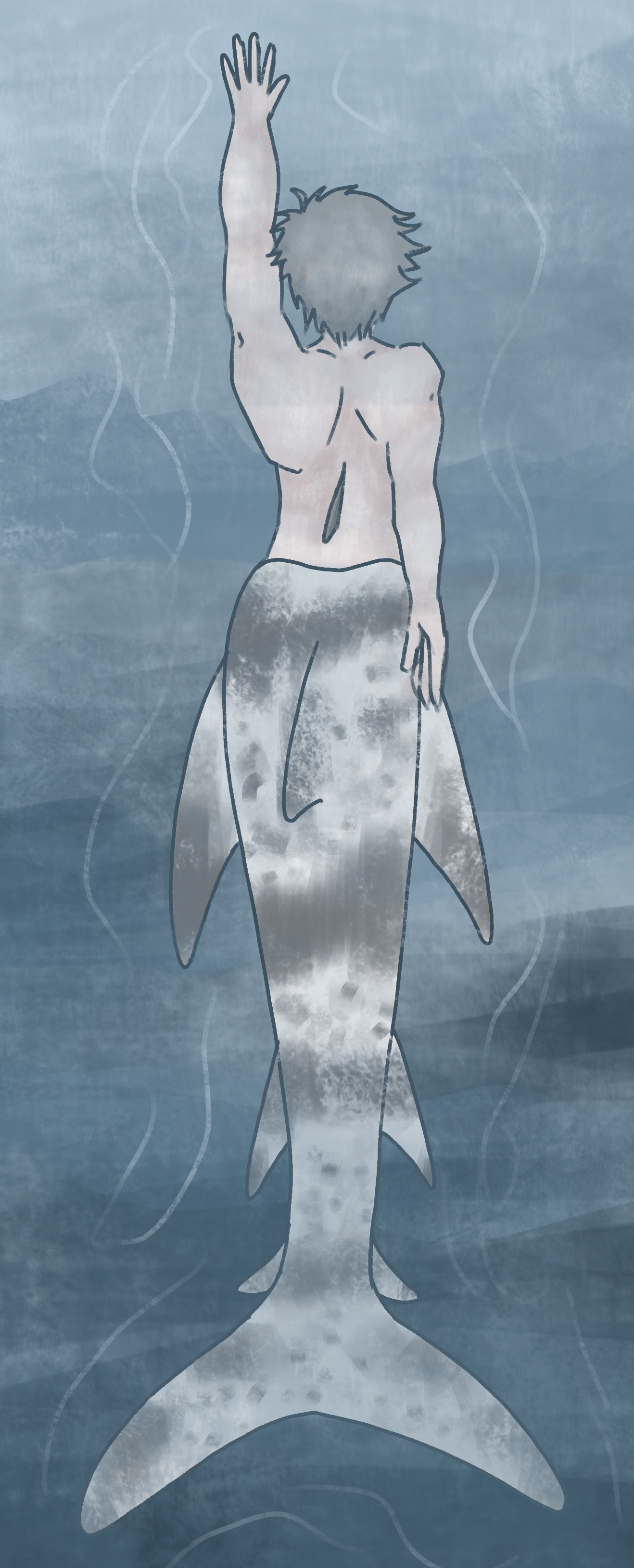
For this underwater merman piece I recreated a project from on Artfight the year before. I never got to hand it in so I decided to recreate it with less time stress and am way happier with how it turned out.
All images are clickable, links are to the characters owner.

All images are clickable (unless stated otherwise), links are to the characters owner.
Click here for characters owners, in order:
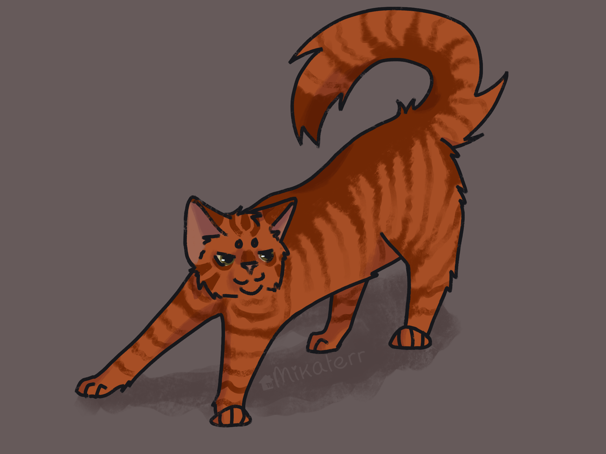
Orange cat attack!

Clicking the image above will take you to my post on Toyhouse which has all the creators who responded to my messages linked. Sadly I was not able to contact all of them since some of them deleted their accounts or are no longer active.
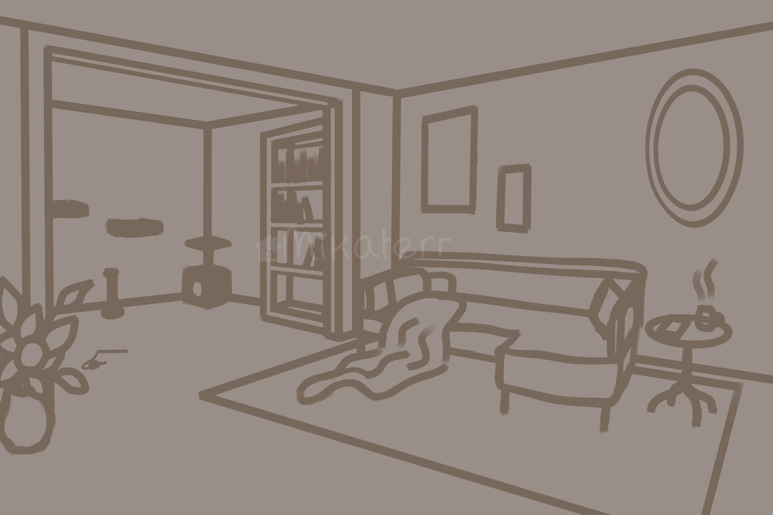

This project is the most intricate piece I’ve ever made, and took over 47 hours to complete. This one was also made for Artfight, as most of the previous drawings were. This was both the first time I made a perspective background, and the first time adding this many characters in one piece. I made a plan before I started, sketching out what rooms I wanted and where I wanted the furniture, windows etc. Even just getting the perspective right in these two rooms took me HOURS, and don’t even get me started on that couch.. I changed the perspective on it more than 3 times and used multiple reference pictures but it never looked right. Eventually I made some guidelines with a vanishing point, and after that it finally looked okay. Messing around with the colors was probably my favorite part of this. This piece was definitely one of the most challenging art projects I’ve ever finished, and I learnt so much from it. <3

This painting was a class project to make a piece that showcases who you are. This was the first time in years I worked with acrylic paint again and it was a NIGHTMARE but I love how it turned out.
Painting
Ps, can you find where Ive hidden my cats? Good luck :)
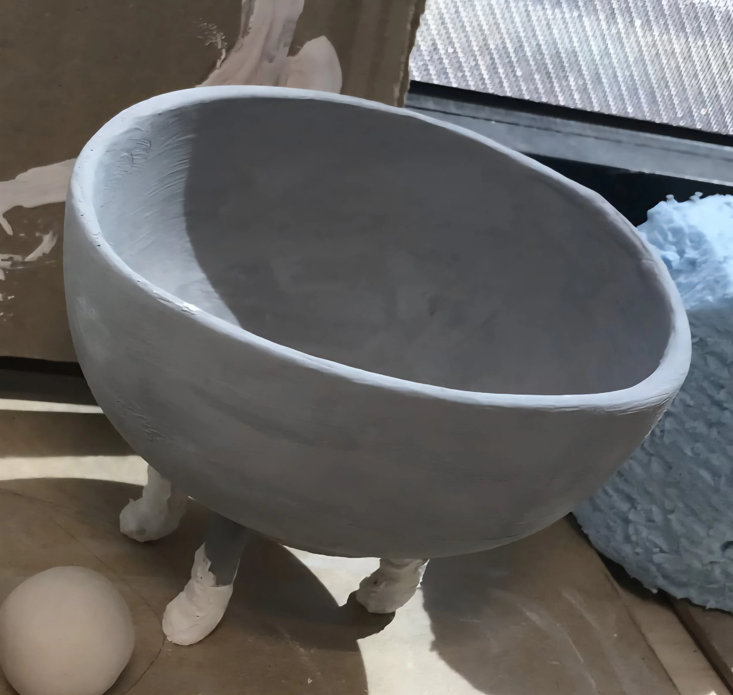
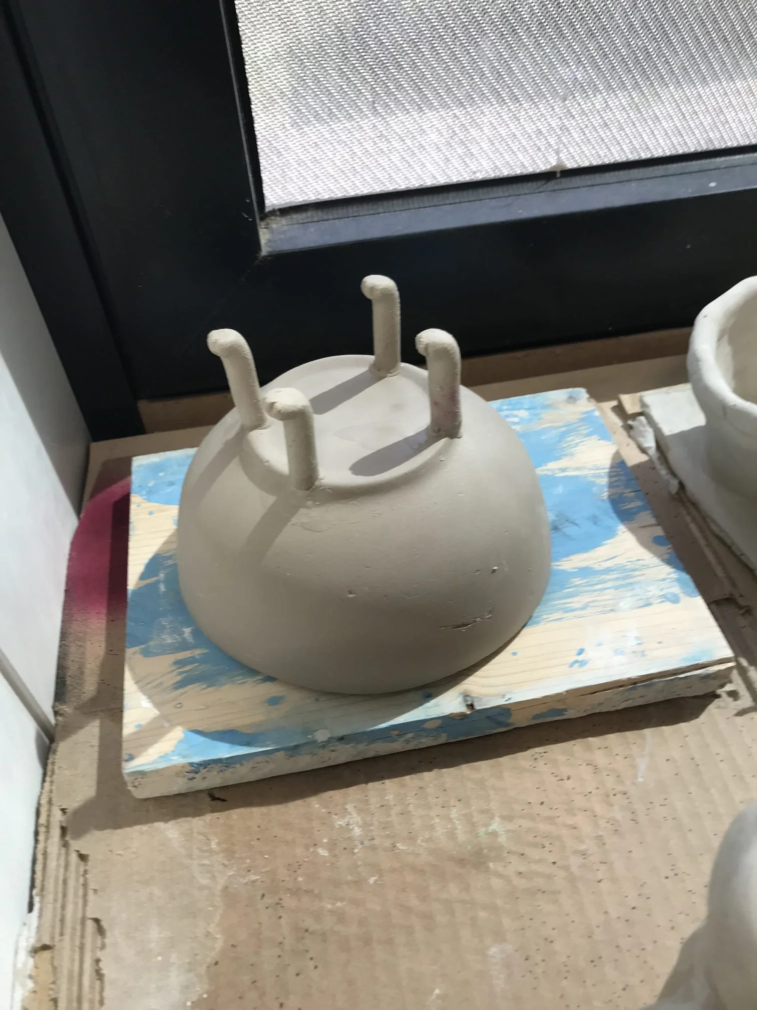
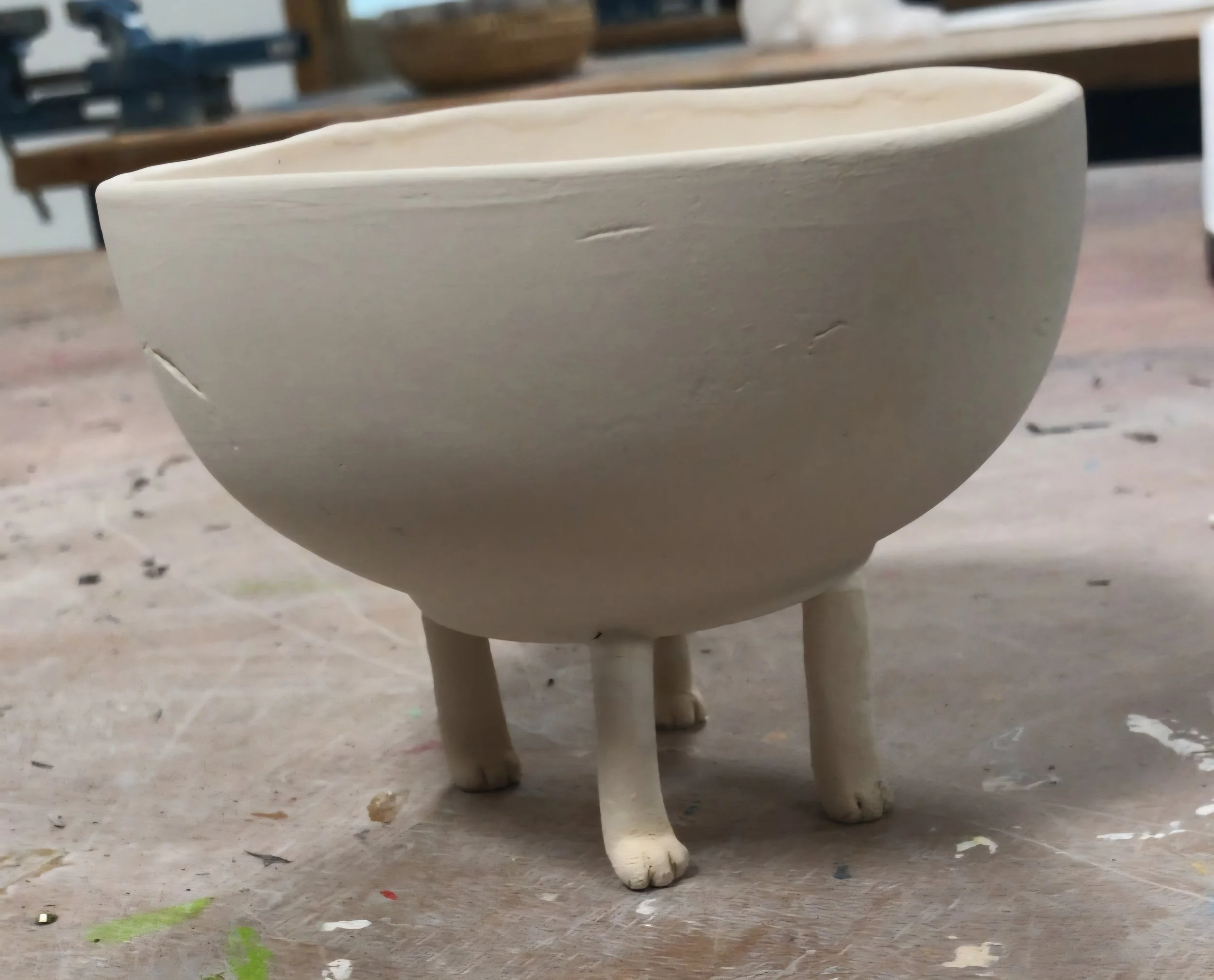
Just wanted to experiment with clay and make a little trinket bowl for myself!
Cat Bowl
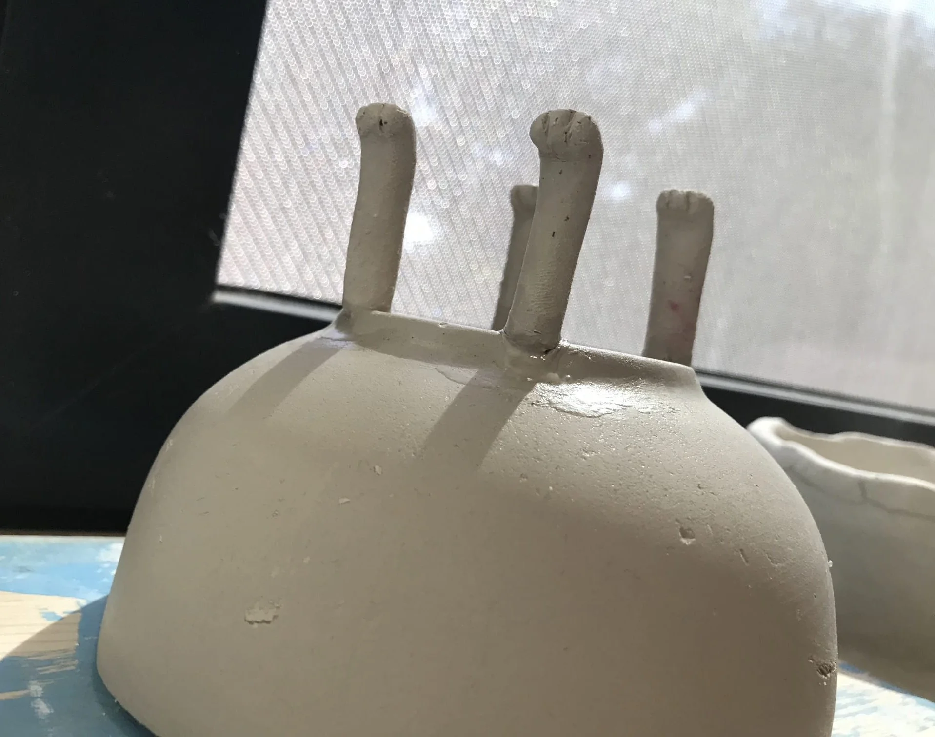
Ps. I sadly no longer have all pictures. The picture of the result has vanished.
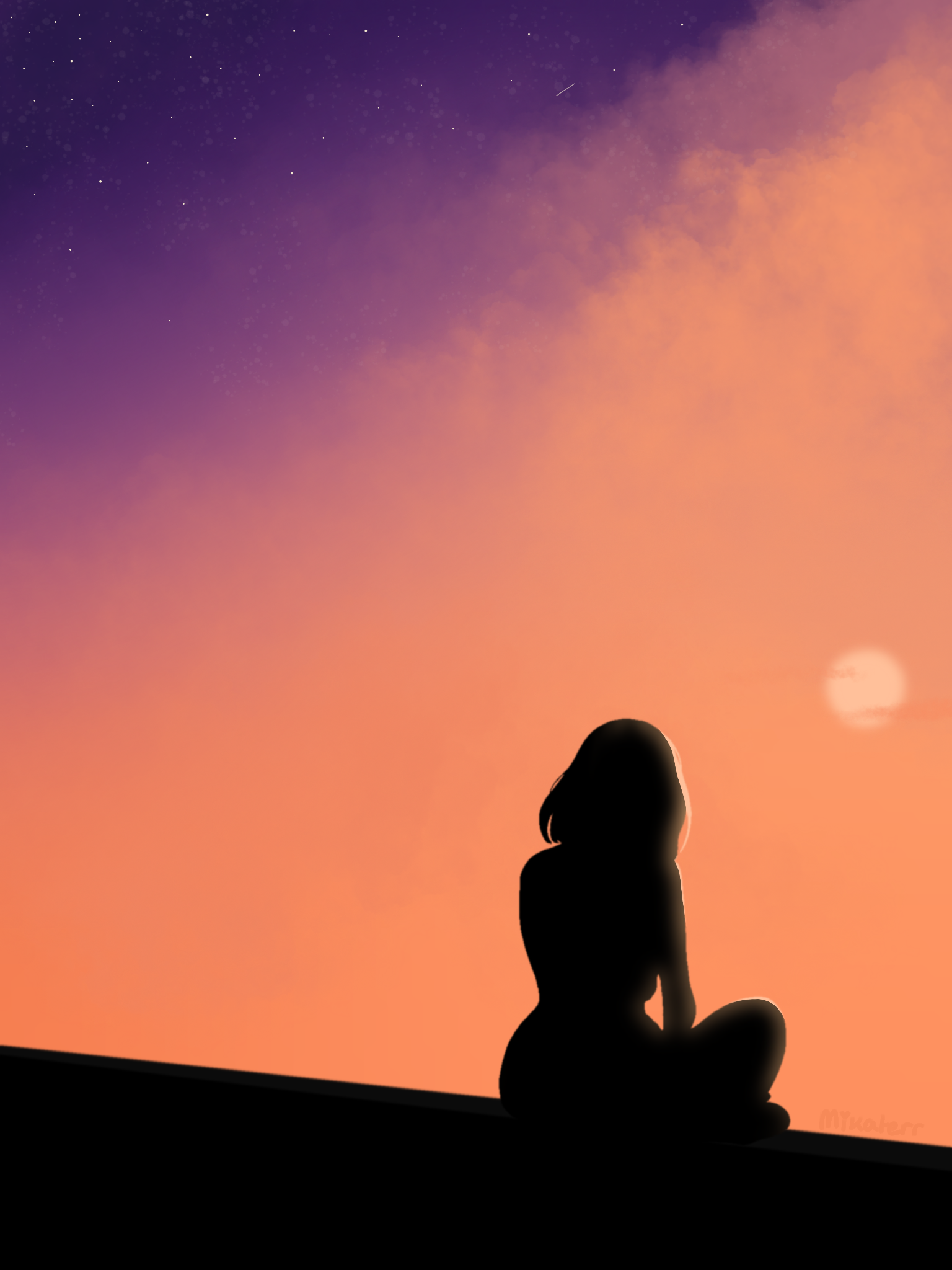
Scenery Pieces


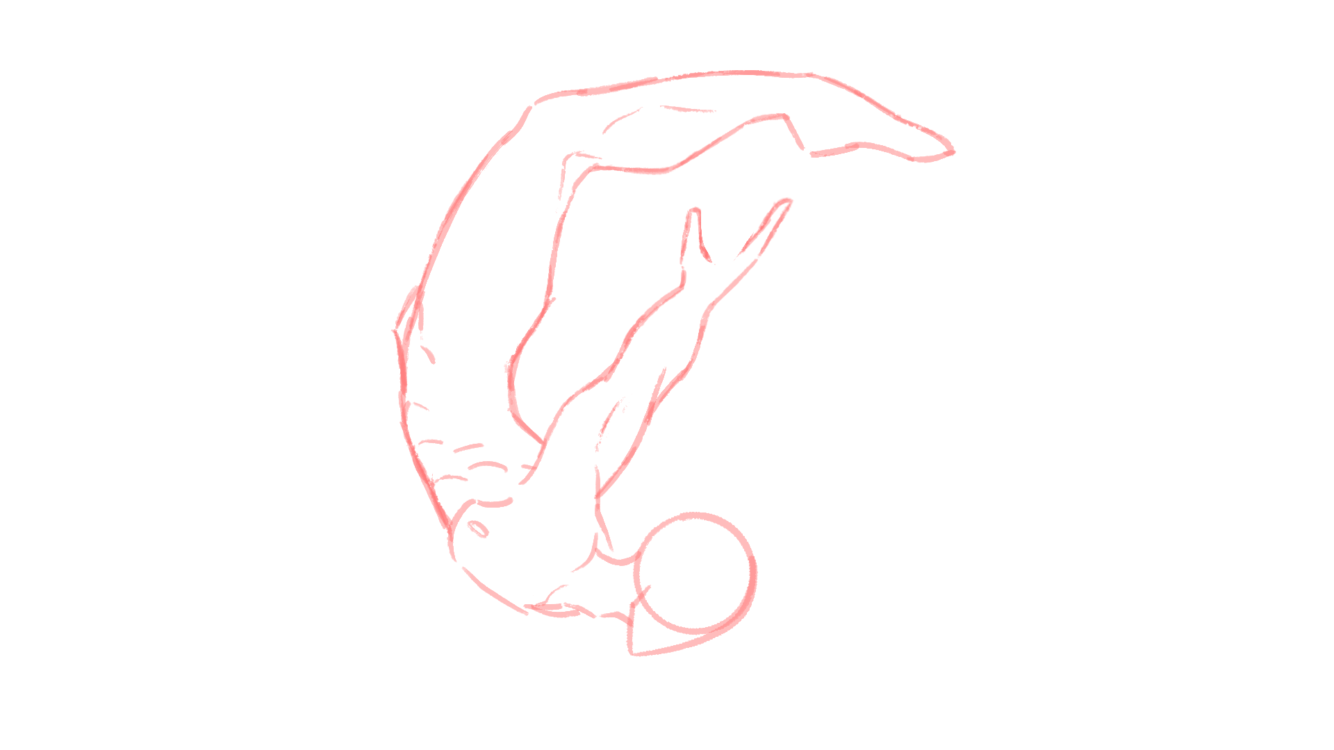
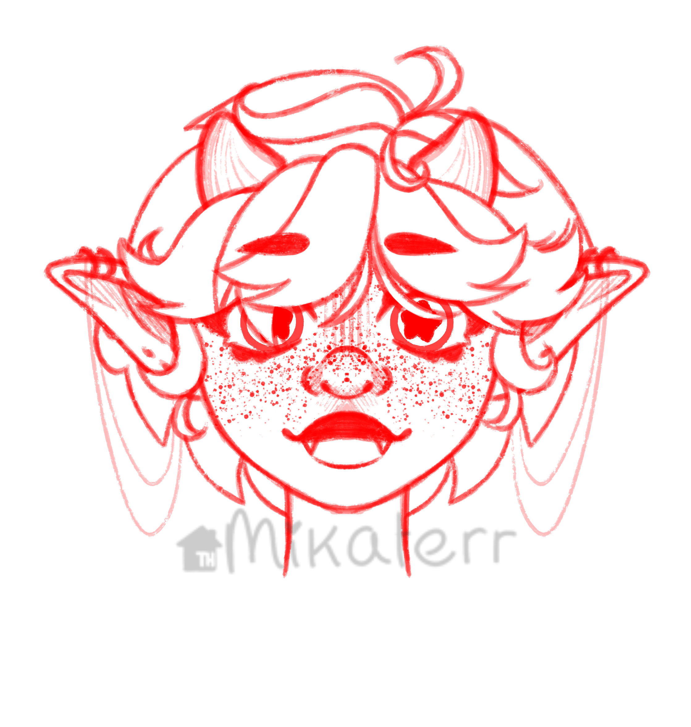
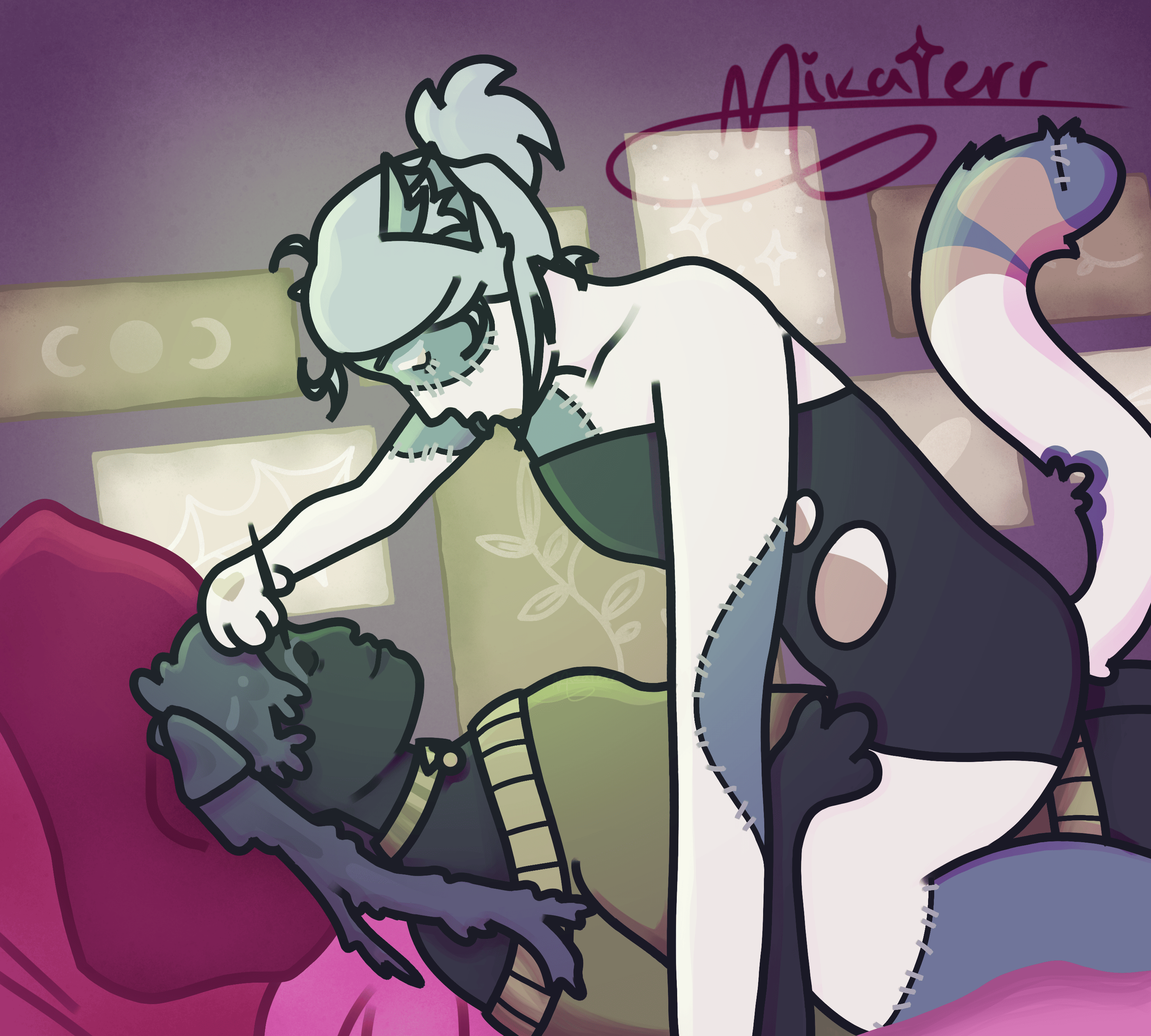
W.I.P.’s / Sketch